People Analytics demystified — Part 4: Mean vs Median
This is the fourth in a series of posts requested by some of our clients on demystifying concepts in analytics. It is intended to introduce analytical concepts to those without a mathematical or statistical background, in a way that is both intuitive and immediately useful.
We hope it will lead to people asking more questions about analytics and pausing to consider implications of analysis they see in their day-to-day work.
If you want to get the entire series over the next few weeks comfortably in your inbox, sign up to our newsletter .
Let’s jump right in. This week’s concept is Mean vs Median.
Introduction
Bill Gates walks into a bar.
No, this is not the start of a joke. So Bill Gates walks into a bar. The average net worth of the 6 other people in the bar just increased to £10.9bn each.
Does this give you a good picture of the distribution of wealth in that bar? Of course not.
At the core of this story lies the problem with using averages (aka the Statistical Mean) to describe a population — and we use the term population to describe any group of people, from an entire country to the employees of a particular law firm. Very often, as in this story, using the Mean is not a good way to describe a situation. To the contrary, using it can be outright misleading.
Defining Mean vs Median
The Mean is what we understand, in common parlance, as the average. The Median is the number in the middle of an ordered set.
Let’s look at all the people in that bar we mentioned, and let’s list their net worth.
We arrive at the Mean by adding up everyone’s net worth (£76,000,957,000) and dividing it between the group members (7). That way we arrive at an average of £10,857,279,571. So far, so obvious.
Let’s now look at the concept of the Median. We arrive at the Median by lining up everyone ordered by their net worth and picking the person in the middle (if there is an even number of people, the Median is calculated by taking the average of the 2 middle people).
Does £75k give us a better picture of the people in the bar? We know that half the people have a net worth greater than £75k, and half the people have a net worth less than £75k. It is a better representation of how much everyone in the bar owns.
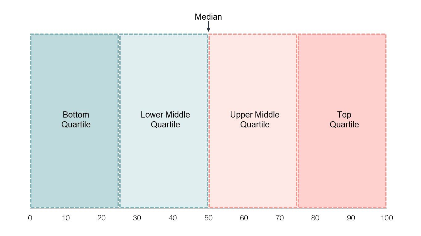
A similar concept we at Pirical use often are Quartiles. While the Median divides a population into two equal halves, Quartiles divide it into four quarters.
Working in HR, when to use which?
The Mean is generally easier to calculate because you don’t have to reshuffle your data. But sometimes it’s worth rethinking why you use which metric.
When to use the Mean:
1) When there is a low occurrence (or probability) of extreme outliers. In that case, Mean and Median will be very close to each other anyway, so it doesn’t really matter which one you use.
2) Also, the larger the sample size, the safer it becomes to use the Mean.
3) Finally, the Mean gives you a fuller picture of your population. For example, let’s say you want to look at the on-the-job performance of trainees by the university they came from, and let’s say these are the numbers:
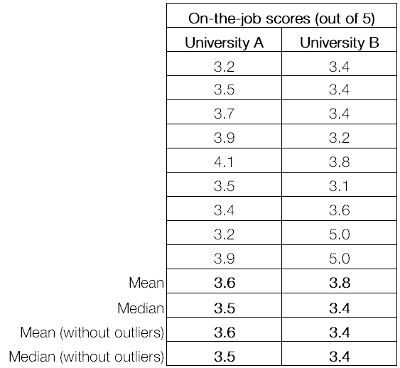
We can see that University B has lower averages than University A if you exclude the two trainees who scored 5 out of 5.
But if you include the two outliers, University B’s average is considerably higher. And if on-the job performance scores are predictive of how much new business these trainees will win one day (which would have to be proven), it would be a better choice to focus recruiting efforts on University B with its apparent 20% share of geniuses.
So in this case, using the Mean makes more sense than the Median.
When to use the Median:
We use the Median when there are outliers that skew the picture.
Example 1:
Let’s say you run employee satisfaction surveys in each department. In one department, you have an average of 5.25 (out of 10), and you know that generally people who score 4 or above, will stay with you. So you are comforted - while not great, that department seems safe.
But then half of the people in that department resign. How is that possible? You look at the individual scores which are: 1,3,3,3,3,9,10,10. The Mean is 5.25, but the Median is 3. It turns out you had quite a polarised population in this team. If you had looked at the Median, you’d have spotted it and could have acted faster.
Example 2:
Another good example is considering salaries in a department, when trying to figure out compensation.
If, for example, the department head has a salary of £250,000, and the four team members earn £50,000 each, and you decide to make an offer to a new employee, what should you use - Mean or Median? Mean is £90,000; Median is £50,000. Obviously, the Median is the best choice
Example 3:
A truism in economic journalism is “the rich are getting richer”. Is this true? If it is, Mean income should be growing faster than Median income. Has it risen faster?
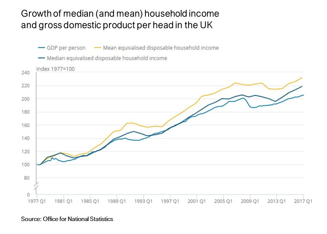
While the data shows that mean income has indeed grown faster than the median (so the rich are indeed getting richer), this growth advantage is not outrageous: While the mean has increased by 130%, the median has grown by 120%. Bottom line: Practically everyone is considerably better off than they were 40 years ago.
Conclusion
In summary, it’s mostly about the outliers: If you want to include them, use the Mean. If you want to downplay them, use the Median.
Whether you feel good about your wealth when Bill Gates walks into your local is completely up to you.
Stay up-to-date with the latest market insights and law firm rankings
Subscribe to email updates
Subscribe to content